Nobody can predict whether the market can go up or down in this manipulated crazy market where bad economic data can turn into positive rally or some rumor or good economic data could lead to big sell off. There are many technical indicator available by different broker. In this article I'll discuss about Simple moving average (SMA) to visualise whether its uptrend or downtrend. You can predict 95% of time correctly.
A simple, or arithmetic, moving average that is calculated by adding the closing price of the security for a number of time periods and then dividing this total by the number of time periods.
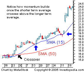
As shown in the chart above, many traders watch for short-term averages to cross above longer-term averages to signal the beginning of an uptrend. As shown by the blue arrows, short-term averages (e.g. 15-period SMA) act as levels of support when the price experiences a pullback. Support levels become stronger and more significant as the number of time periods used in the calculations increases.
I use google finance for most of my trading http://www.google.com/finance
The chart is simple and easy to use. Set it to 1d by clicking on 1d inside chart. Below I have shown how to set the chart.
 |
| Go to http://www.google.com/finance then click on Dow Jones and then click on 1d, and then set Technical to simple moving average |
 |
| Set SMA to 20 and 50 |
 |
| Practical example of uptrend and downtrend |
 |
| Dow jones April 27th chart - look for curve in SMA(20) which decides whether stocks will be in uptrend or downtrend in advance. Use this technical for any stocks. |
 |
| EXPEDIA chart for April 27th, Since Stock opened leg up, it was a bullish sign or uptrend, and as soon as SMA(50) crossed above SMA(20), stock started sliding down. |
 |
| Sandisk chart for April 27th, look for the curve in SMA(20) to know if it will be uptrend or downtrend. |
 |
| Aapl chart for April 27th, Blue arrow shows the curve where SMA(20) will start crossing SMA(50) which is bullish sign, you should buy share or buy call at this point. Red arrow curve shows downtrend when SMA(20) will cross and stay below SMA(50) at this point buy put or short stock. |
 |
| VIX is in contango, so after initial rally, its likely to sell off. As you can see in TVIX, it started with bullish trend, but a curve was formed and from that point the stock was likely to sell off. SMA(20) was below SMA(50) and so the sell off continued. |
 |
| UVXY selling off after initial rally as vix is in contango. Red circle is bearish sign, blue cricle is bullish sign |
 |
| SVXY selling off after initial rally as vix is in contango. Red circle is bearish sign, blue cricle is bullish sign
|
 |
|
XIV rally after initial sell off as vix is in contango. Red circle is bearish sign, blue cricle is bullish sign
|
 |
| VXX sold off after initially rally as you see SMA(20) formed a curved where it reversed the uptrend to downtrend. Also at one point it seems SMA(20) would cross SMA(50) and it could rally upside but instead it sold off. This kind of chart is bit tricky to predict. |
It is very easy to visualise the uptrend or downtrend. Look for the curve in advance for the uptrend or downtrend. Usually, there is 2-3% move upside or downside, so take advantage of it. Just try yourself and see if you find this tool useful while trading. Goodluck...!!
Please visit our sponsor at the top or side bar if you find this article useful.


1 comment:
Very informative, keep posting such good articles, it really helps to know about things.
Post a Comment